So Safe.
Making cybersecurity more approachable—and creating space for belonging. At SoSafe, I worked across two areas: illustrating e-learning in junior art direction, then designing brand and community assets in marketing.
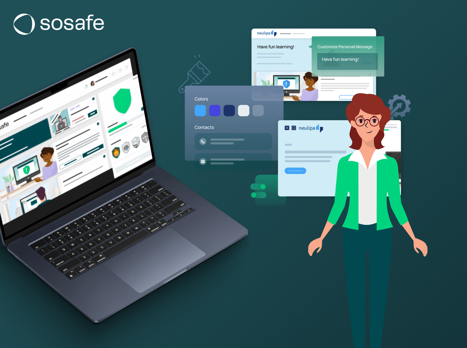
Making cybersecurity feel human.
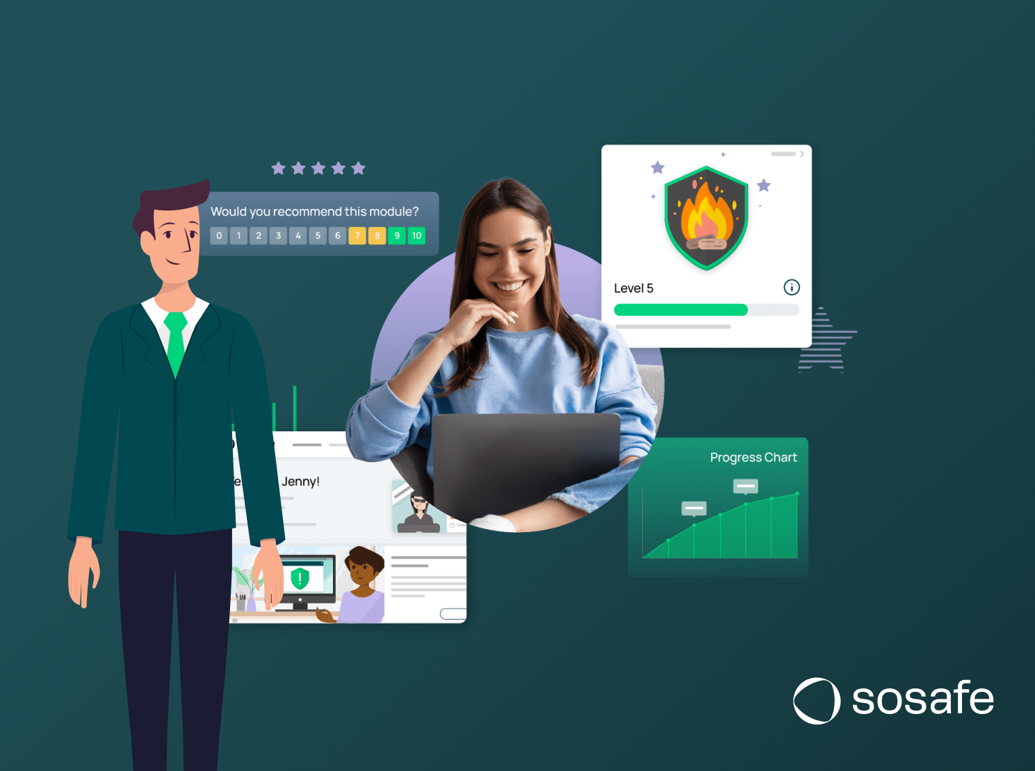
I created characters and visual scenes for cybersecurity e-learning, turning topics such as phishing and ransomware into clear, relatable stories. Working with the learning and marketing teams, I kept the illustrations consistent with SoSafe’s visual language.
An identity for belonging.
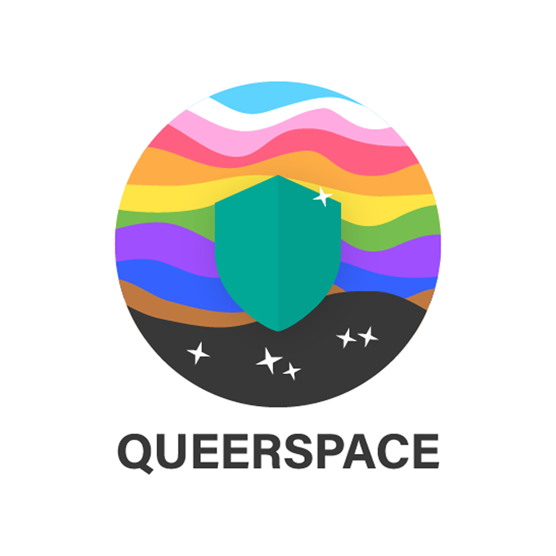
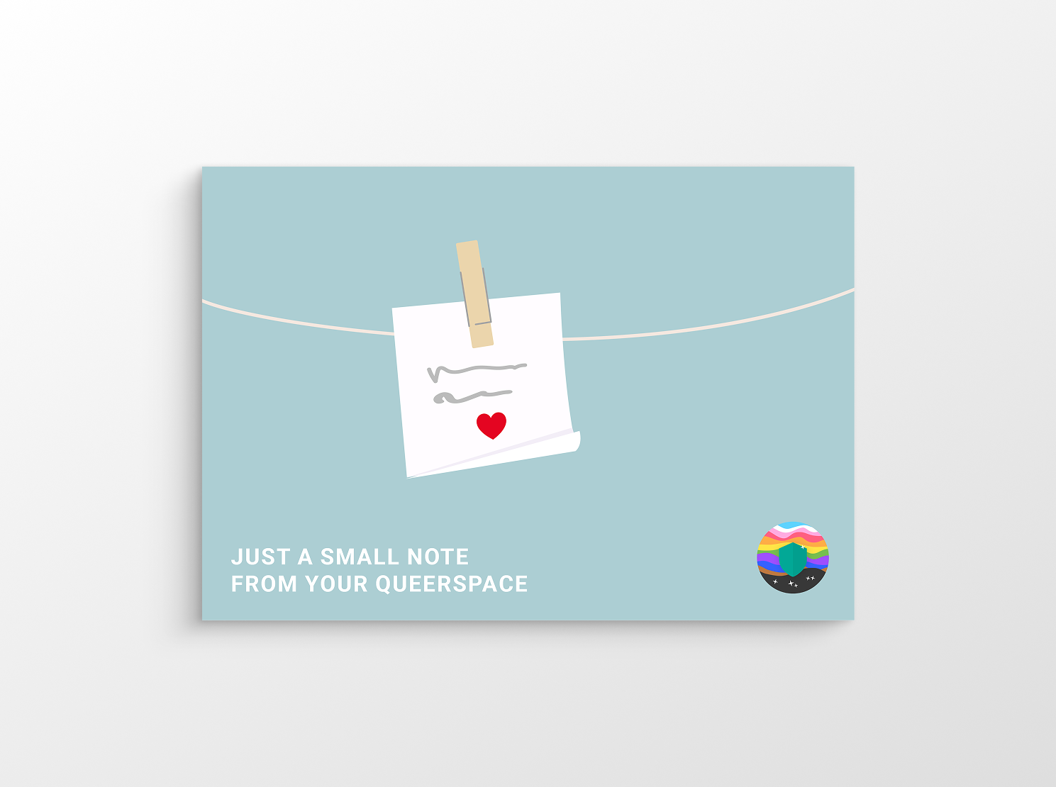
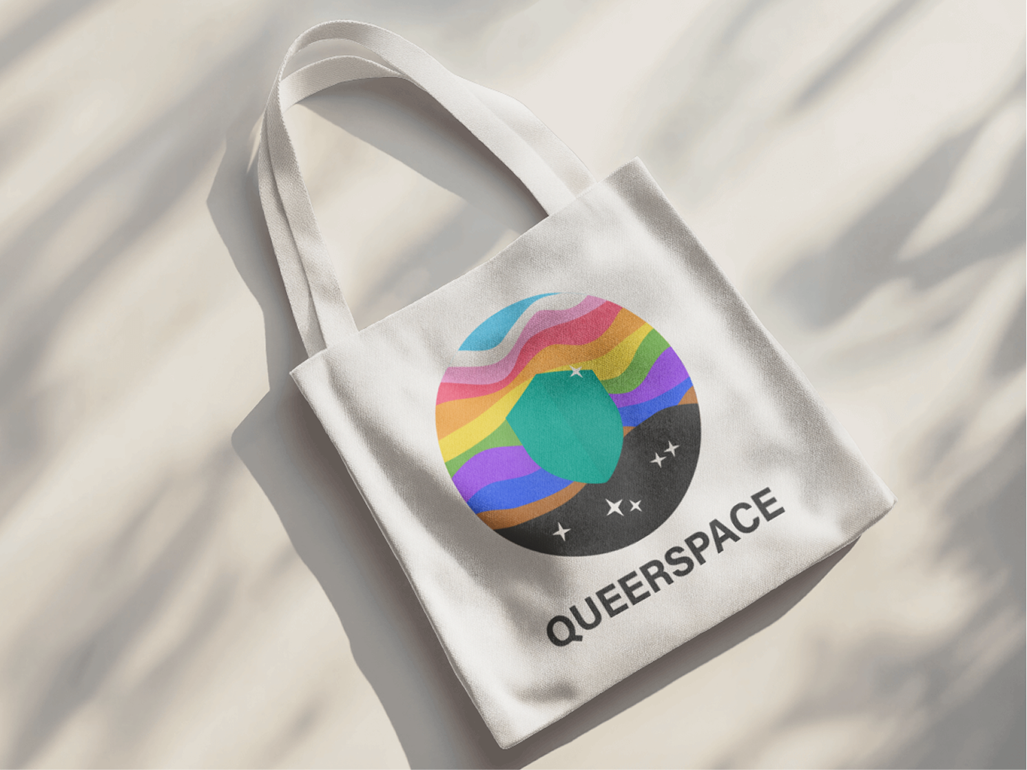
For Queer Space, SoSafe’s internal LGBTQ+ community, I designed a logo and a family of assets: a postcard sent to employees, stickers and tote bags. The aim was a recognisable, welcoming identity for a safe space within the company.