MACH!
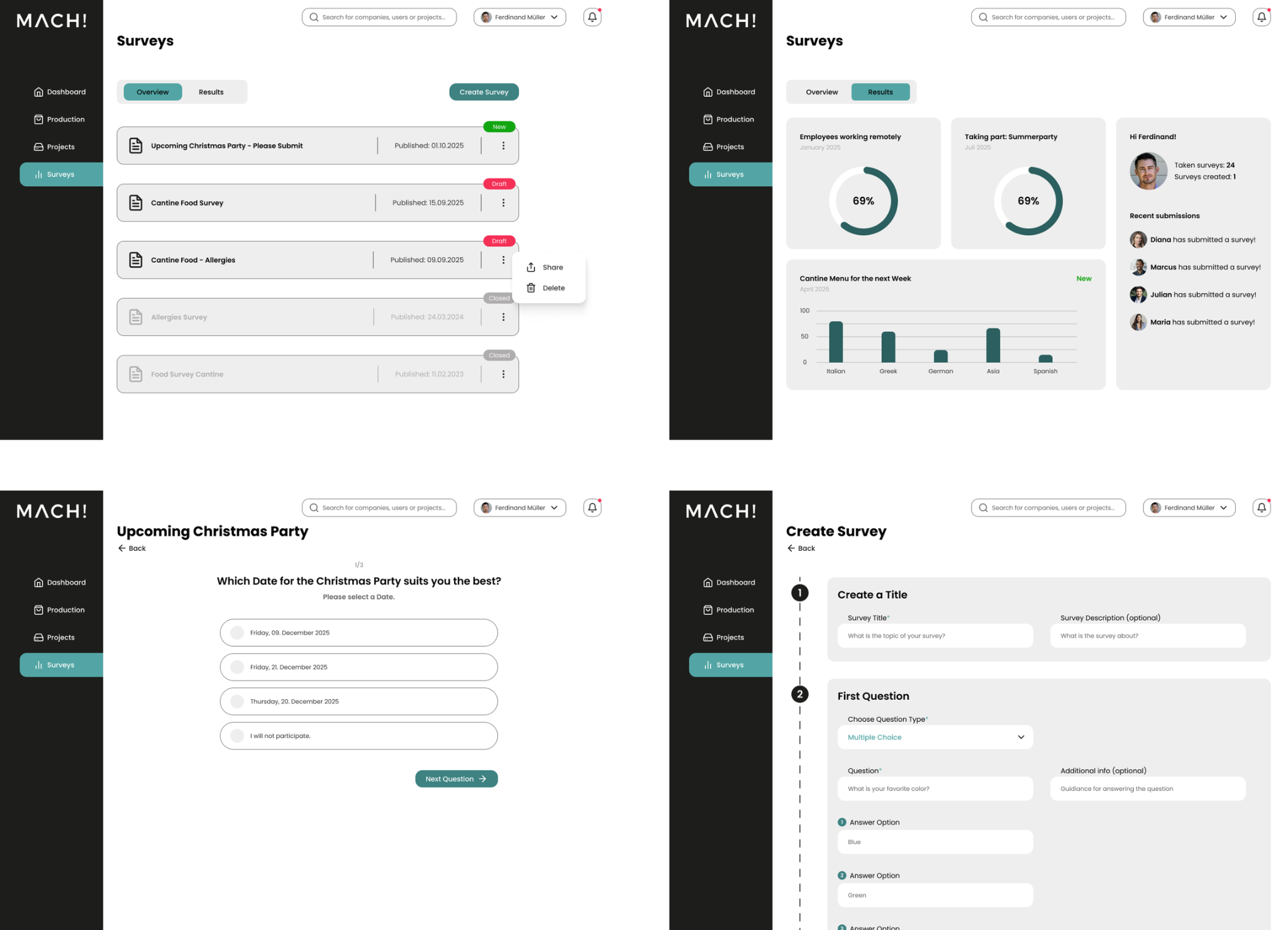
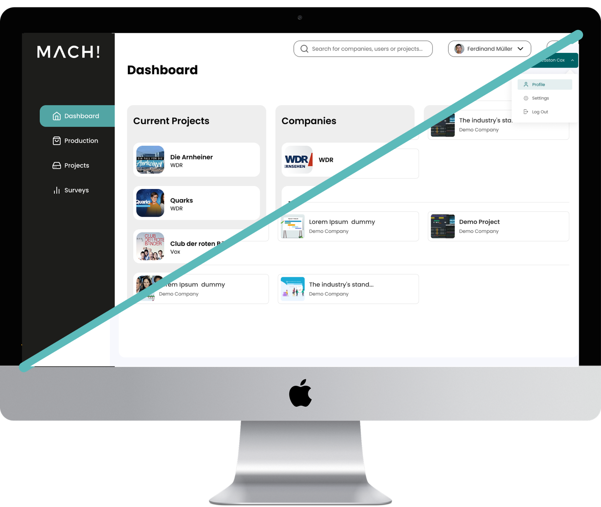
MACH! is an internal web app for a film and TV production company. I redesigned its dashboard and introduced a survey section to help employees find projects, share feedback and review responses. The goal: a clearer, more intuitive experience within the existing technical structure.
A clearer view of daily work
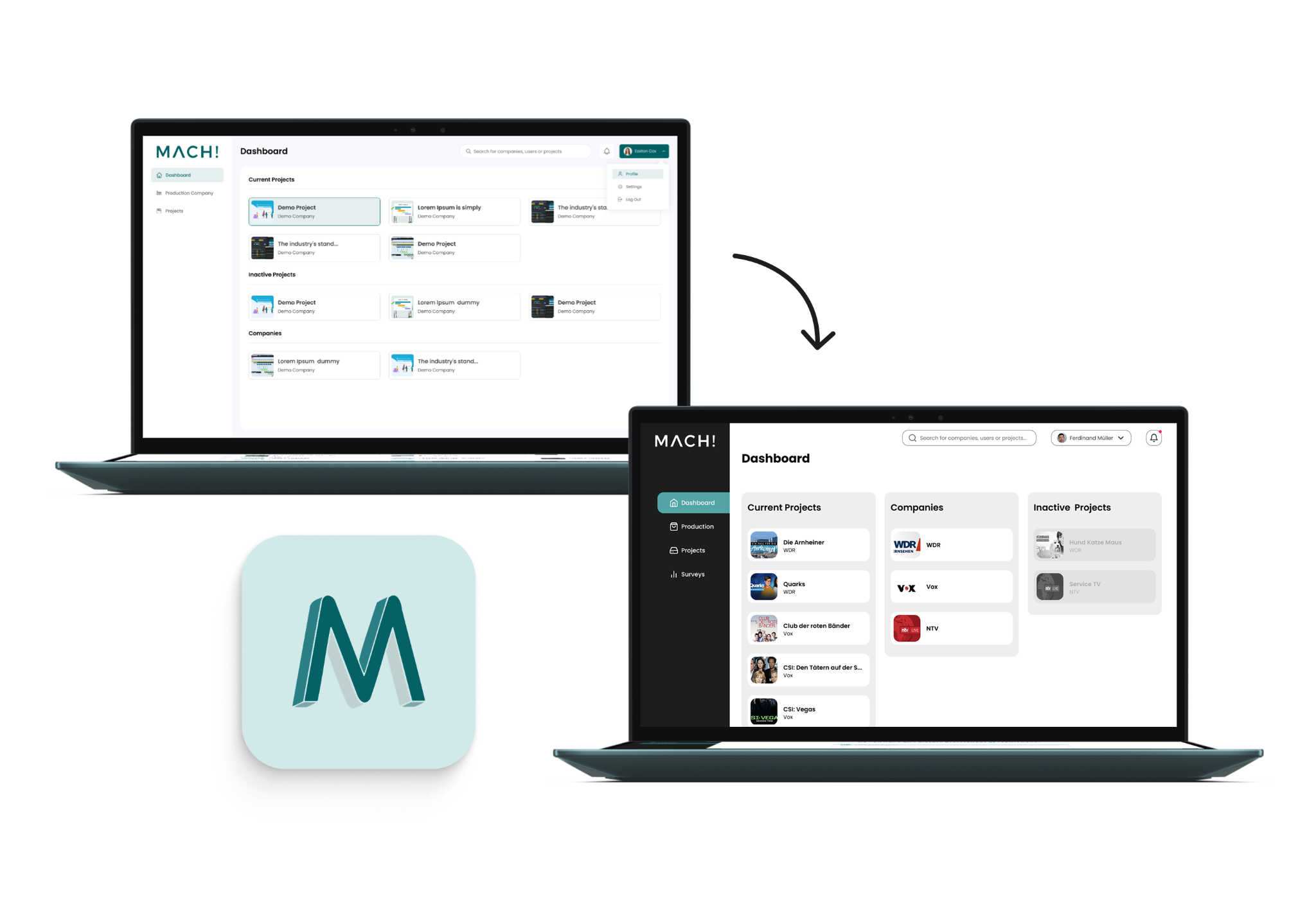
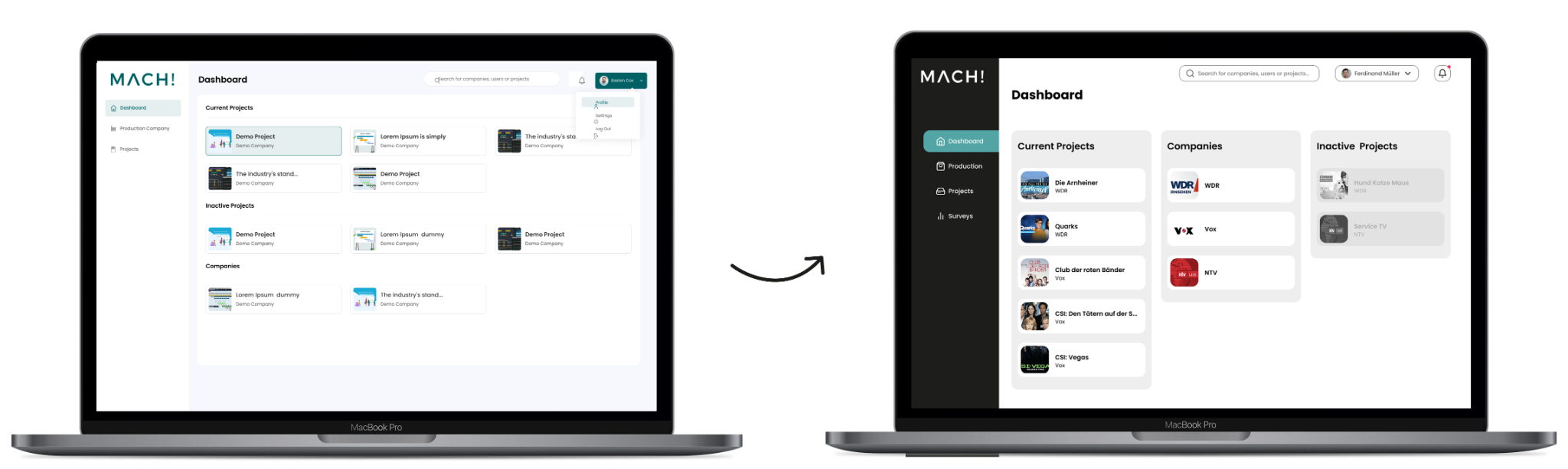
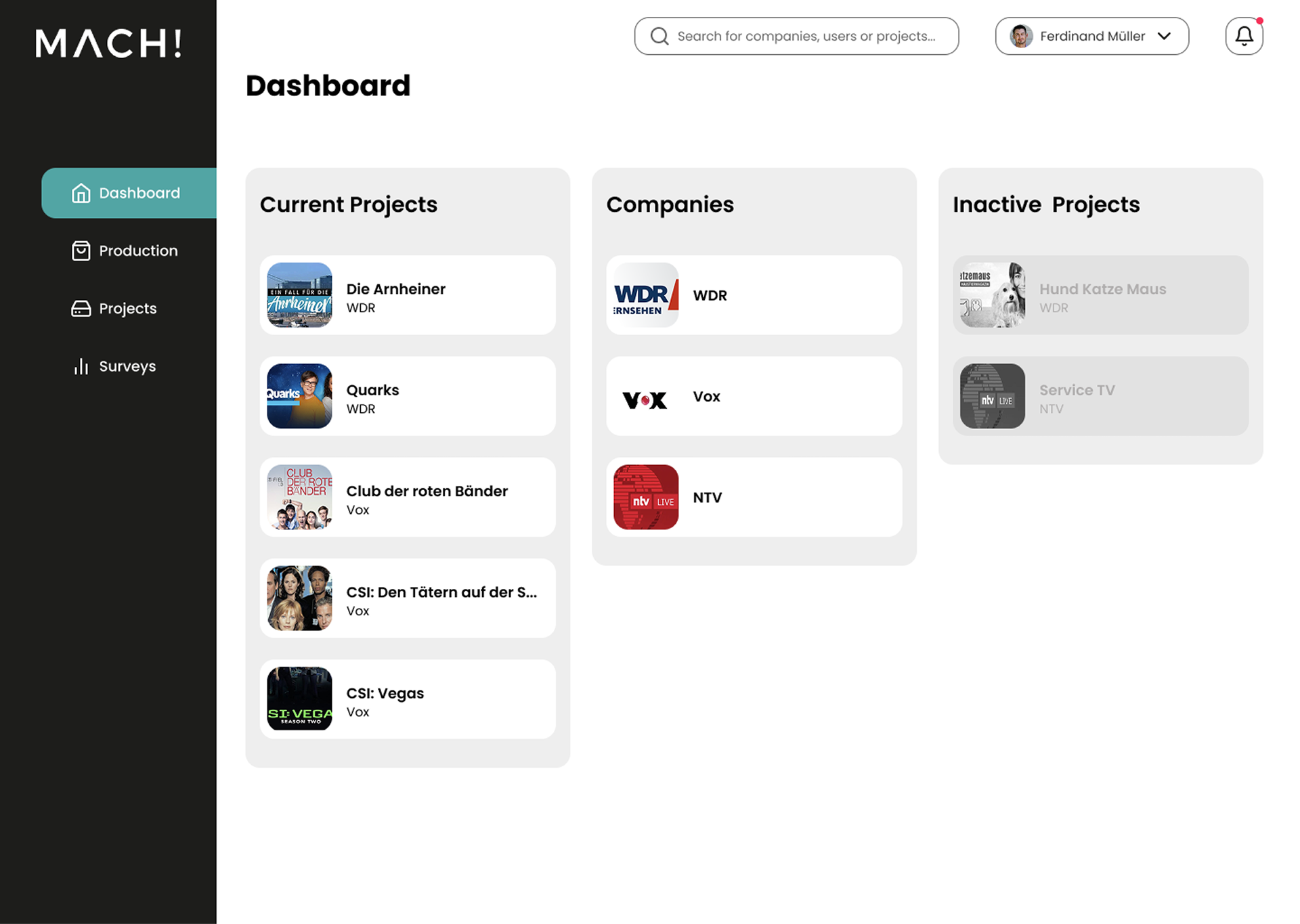
I grouped current projects, companies and inactive projects into side-by-side columns. Familiar cards and stronger visual separation make the categories easier to scan and compare, reducing the need to scroll through long lists.
From questions to clear answers
The new survey area brings creation, participation and results together. Two tabs separate the overview from results; status labels pair colour with text, and a guided vertical flow supports different question types. Reusable components keep the design manageable within limited development capacity.