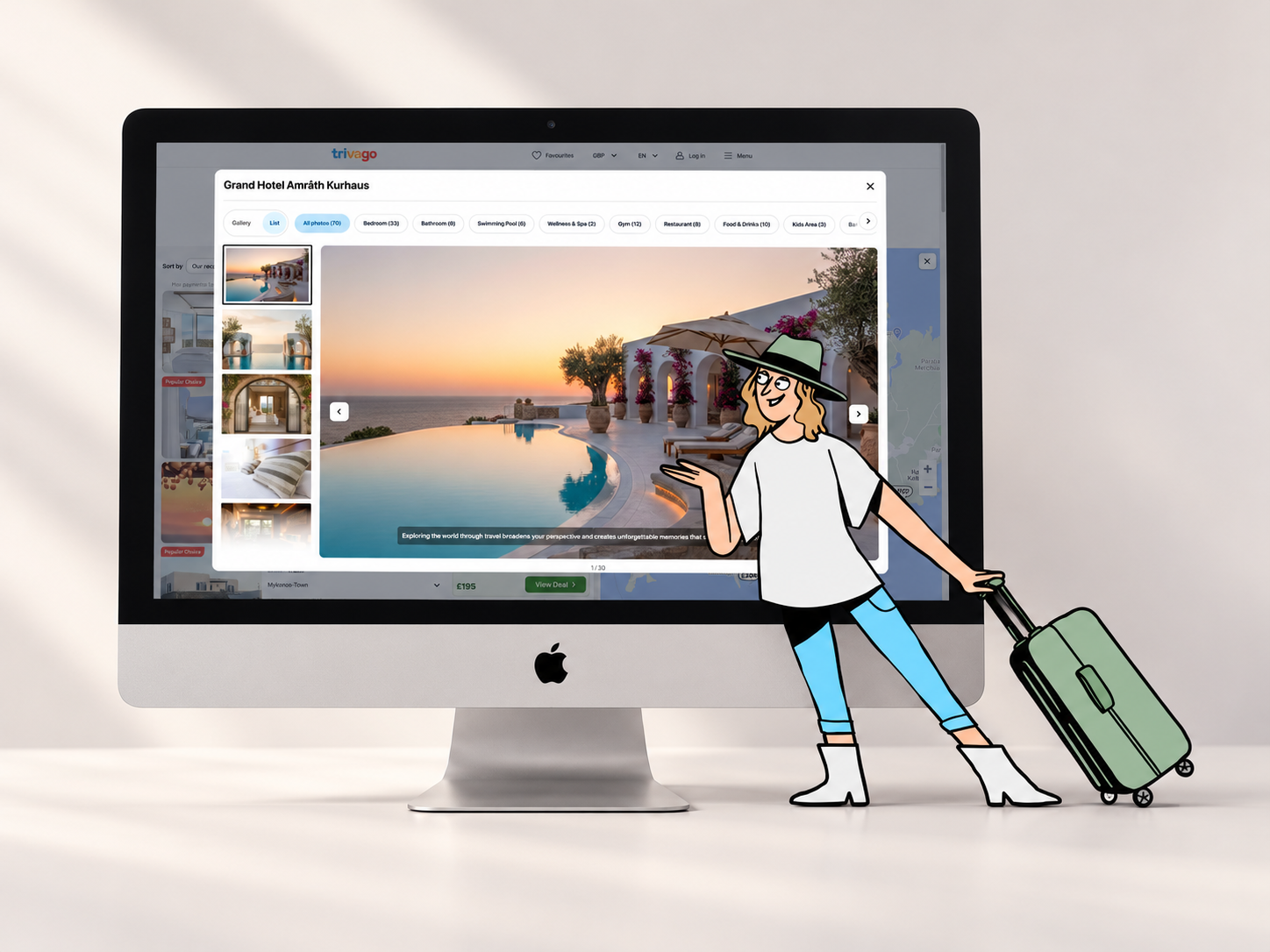
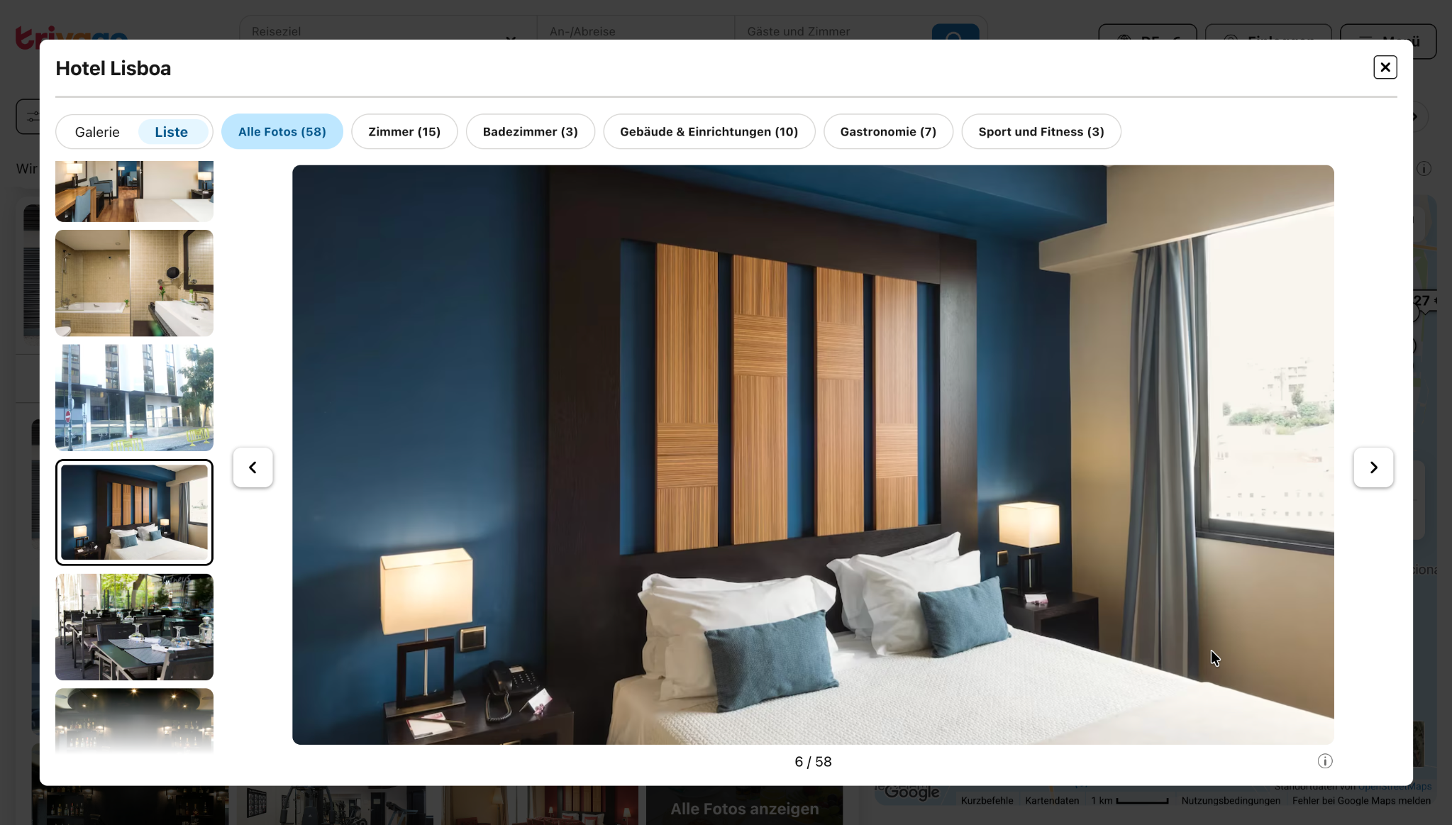
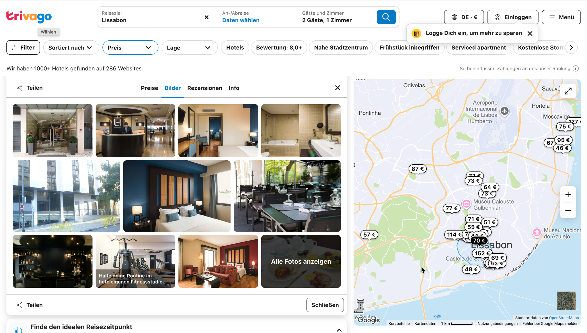
Hotel photos help travellers choose where to stay. At trivago, I redesigned the image gallery overlay so mixed image sizes felt consistent — with less empty space and a steadier browsing experience.
Product design
trivago
Live on trivago.com
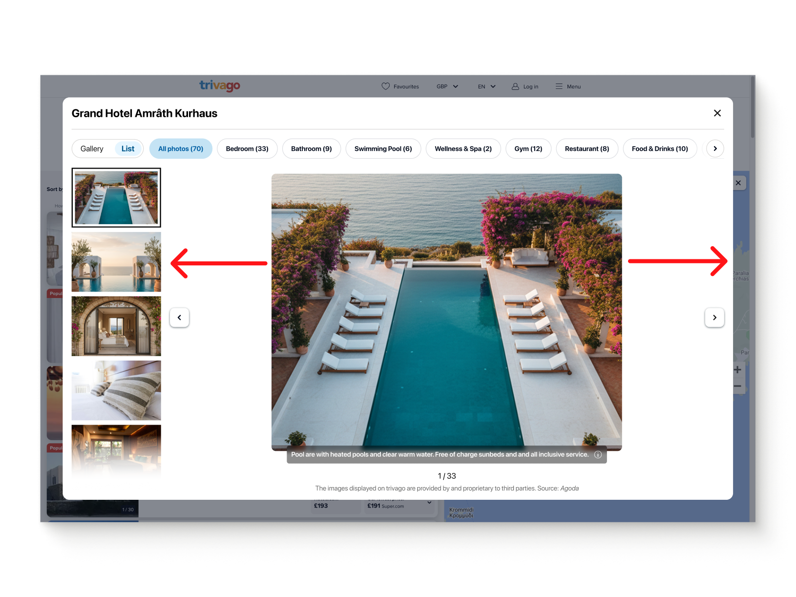
Before
Mixed image ratios left large gaps around the photo.
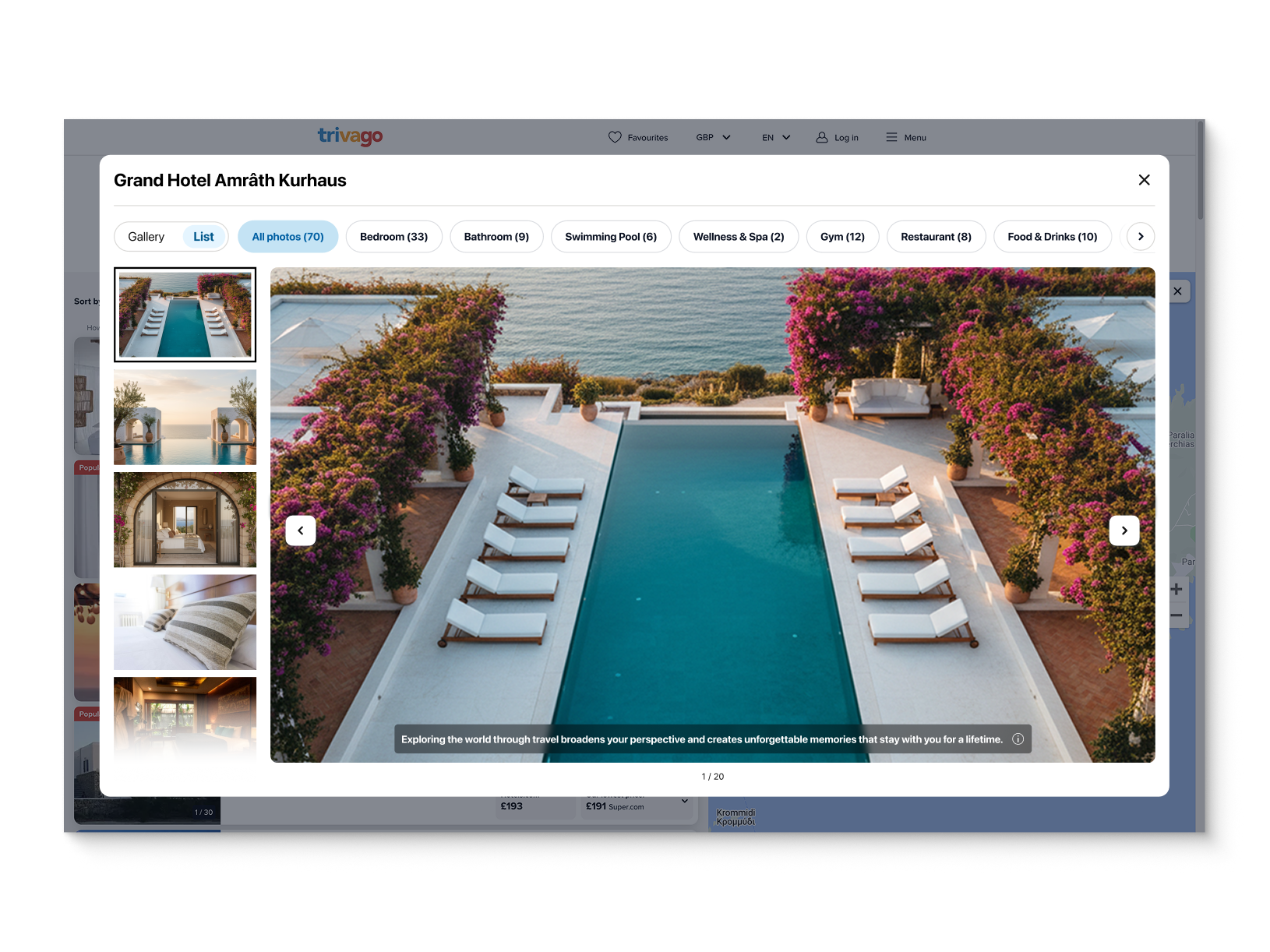
After
A consistent frame gives the photo more room.
A steadier frame. A clearer view.
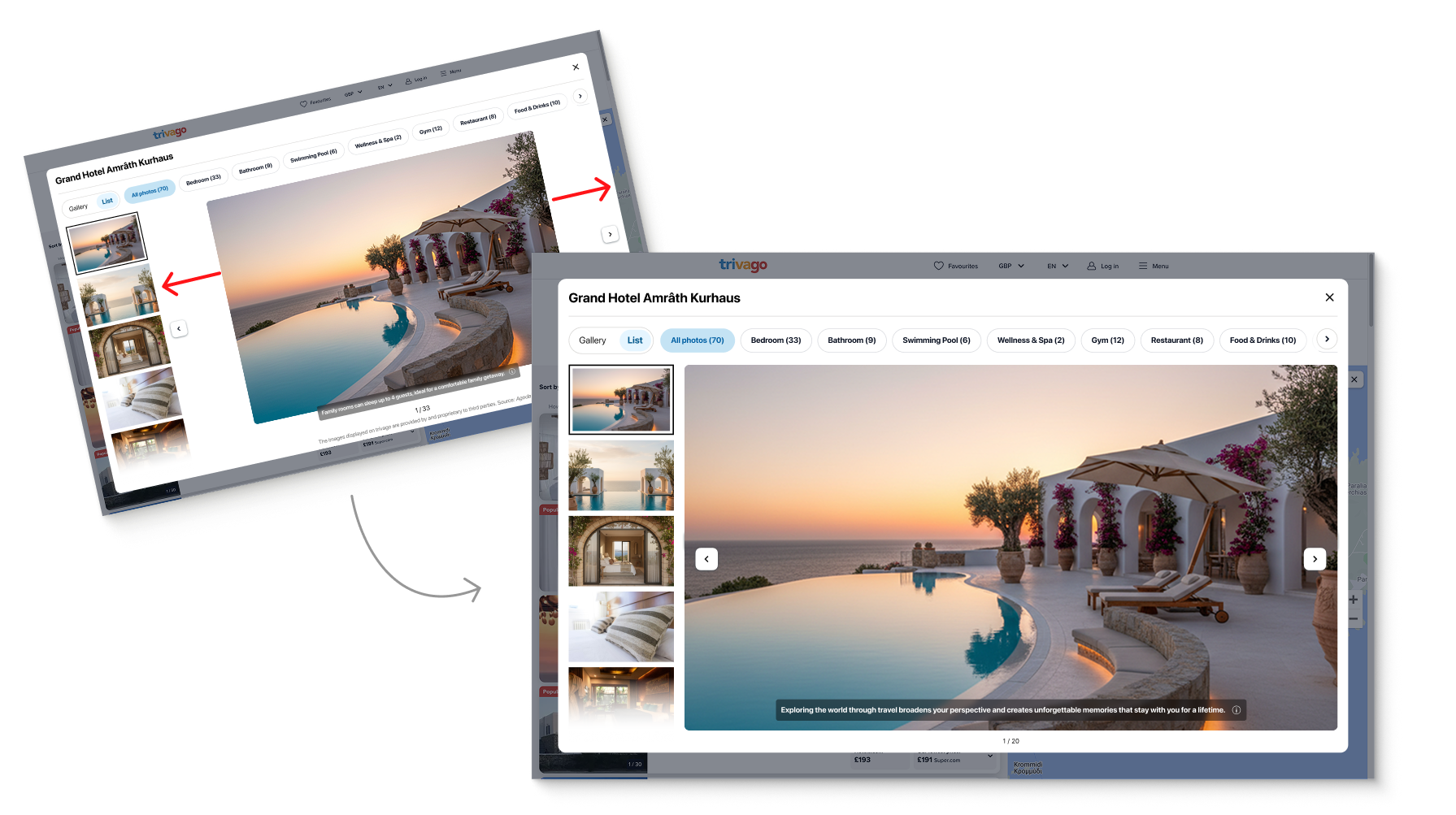
I chose a consistent frame with a lightweight CSS approach to reduce whitespace and visual jumps. The trade-off: slight zooming for a small minority of images. I prioritised a smooth browsing flow while avoiding aggressive cropping.
The gallery in motion.
Tested, then shipped.
Two A/B tests validated the approach. The accepted test showed a 3.5% increase in image click-through rate, and the update went live on trivago.com.